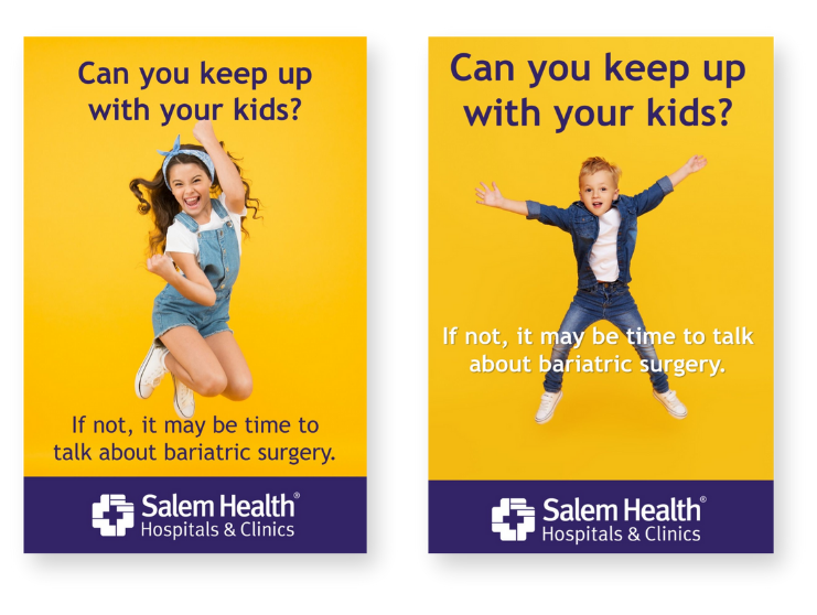
Fixing the Funnel
How better patient experiences drove 50% more surgeries and doubled engagement. A complete rebuild of how patients discover, trust, and move through care — from first click to lasting change.
Project at a Glance
- 50% increase in surgeries within nine months
- Support-group participation doubled
- Incomplete form submissions dropped to near zero
- Mailing and admin costs reduced dramatically
- Advertising + SEO filled the patient pipeline to capacity
Background
When I joined Salem Health’s Bariatric Surgery Clinic, the program had excellent clinical outcomes, but struggled to grow. Patients were starting the process, but rarely making it to surgery.
Many patients weren't aware of the reasons that might disqualify them from surgery (e.g., not quitting smoking, weighing too much). The first two appointments with the clinic were meeting with a nutritionist first and then with a surgeon—both appointments were offered at no cost to the patient. All too often, patients would find out while meeting with a surgeon that they were not eligible for bariatric surgery. This frequent scenario cost the clinic in time, money, and resources.
The goal: Create a funnel where unqualified people didn't even enter, elevate the clinic’s credibility, simplify the patient experience, and turn interest into action.

Challenge
The patient journey was confusing and inefficient from the start. When someone expressed interest in bariatric surgery, staff mailed a thick packet of mixed materials — forms of different sizes, brochures from different organizations, and no consistent branding. Each packet had to be assembled by hand.
Many patients never returned the forms, or sent them back incomplete. Staff then mailed another partial packet, wasting time, money, and effort.
Meanwhile, the website was outdated and text-heavy, lacked mobile functionality, and didn’t reflect the quality of care offered. With no online intake process and minimal advertising, potential patients often never reached the clinic at all.

Objectives
- Simplify and modernize the patient journey.
- Reduce mailing costs and staff workload.
- Strengthen brand credibility and digital visibility.
- Increase qualified leads and surgical conversions.
- Improve post-surgery engagement and long-term retention.
Strategy
The strategy centered on three ideas: clarity, credibility, and consistency. The work was a full-funnel transformation combining website rebuilds, SEO optimization, bilingual content, education resources, and digital advertising.
Clarity
- Redesigned website navigation
- Launched bilingual content
- Simplified forms
Credibility
- Improved visual design
- Added patient testimonials
- Strengthened SEO
Consistency
- Unified messaging
- Created digital assets for staff
- Built an analytics dashboard
Taking Action
To reach my objectives while following my strategy, the next steps forward were big, yet important. I didn't want to create a quick solution that would require another big investment soon. I wanted to create impactful, lasting change. The following actions would create that change.
- Rebuild the digital experience
- Create an easy-to-follow onboarding journey
- Develop patient education materials (online & offline)
- Expand awareness with advertising
- Improve post-surgery engagement
- Elevate the brand at every touchpoint
Rebuild the digital experience
Before the redesign, the bariatric surgery website felt outdated and disconnected from how patients actually made decisions. Important details were buried under long paragraphs, and the site lacked a clear way to move from interest to action. Analytics showed high bounce rates on key informational pages and little engagement with conversion points such as seminar sign-ups and consultations. The digital journey didn’t match the emotional and practical steps patients were taking offline, making it harder for them to take the next step with confidence.
I rebuilt the journey around patient needs and questions. The site now guides people through simple steps—check eligibility, watch the info session, and see what to do next. I created a resources page for both pre- and post-surgery patients, set up easy access to support groups, and rewrote FAQs in plain language so patients can move from “curious” to “ready” with confidence. I also aligned messaging with patient motivations gathered from surveys and staff feedback, ensuring the site felt human and trustworthy.
Each change was deliberate, reduced friction, and made the next step obvious.
Old Homepage
- Cluttered layout: Competing boxes and colors make it hard to follow a clear journey.
- No hierarchy of actions: Users don’t know where to start — multiple “More…” links cause confusion.
- Outdated visuals: Stock-style imagery (e.g., checklist, stomach diagram) feels impersonal and clinical.
- Lack of story or emotion: No real patient stories or visual warmth; doesn’t inspire trust or motivation.
- Poor mobile experience: Multi-column grid and heavy text don’t scale well.
- Weak conversion path: No clear funnel toward consultation, seminar signup, or contact form.
New Homepage
- Streamlined navigation: Clear single journey from awareness → eligibility → action.
- Human-centered design: Real patients, video stories, and lifestyle imagery replace stock visuals.
- Emotional connection: Motivational messaging (“real stories,” “start your journey”) drives engagement.
- Modern layout: White space, consistent color palette, and scannable sections improve readability.
- Mobile-first design: Responsive structure with strong CTA visibility across devices.
- Conversion optimization: Simplified paths for “Take the quiz,” “Attend a seminar,” or “Contact us.”
- SEO & accessibility: Updated page titles, headers, and alt text improved search visibility and ADA compliance.
Create a guided 5-step onboarding journey
The onboarding process was arguably the crux of the problem. The clinic team only said they wanted more patients, but I could see clearly the biggest obstacle was onboarding.
After implementing this process, incomplete submissions dropped to nearly zero, while staff regained hours each week that had been spent compiling and mailing packets.
Step 1: Make sure you qualify
I started the process with eligibility so people quickly know if bariatric surgery is an option—or how it could become one. Before asking anyone to fill out forms or book appointments, I thought it was necessary to have them check the requirements. This sets expectations, prevents frustration, and saves time so qualified patients can move forward faster.
Step 2: Watch an information session
I replaced the monthly in-person info session with a single on-demand video. We tightened and cleaned up the existing video to meet brand standards and ensure it was easy to follow. Sending everyone to the video removed even more friction and drove far more completions. Paired with the Getting Started steps and FAQs, patients arrived better informed before any form or appointment.
Step 3: Submit your forms
The previous website had the necessary forms on different pages. I consolidated the forms into one place. This helped patients know what forms to complete ahead of time. It also cut down on the amount of time clinic staff spent trying to get patients to complete all the forms.
Step 4: Find out what your insurance covers
This was a step a majority of patients used to skip. Adding it to the Getting Started page allowed patients to fully understand their costs before scheduling an appointment.
Step 5: Complete a screening phone call
The final Getting Started step was talking with someone from the clinic. Before I implemented this 5-step process, patients frequently called the clinic. This final step sets the expectation that a phone call will happen, but only after steps 1–4 were completed.
Develop Patient Information Materials
Patient Information Packet
24 pages
The Patient Information Packet was designed to guide prospective and current patients of the clinic through every stage of their journey. It uses accessible language and visuals, helping patients understand treatment options, risks, and post-surgery commitments. The packet also includes a timeline so patients know exactly what to expect and how to prepare. My role focused on restructuring the content flow, creating bilingual layouts, and collaborating with the internal team to align style and patient-centered messaging.
Nutrition Manual
24 pages
The nutrition manual supports patients through each stage of their weight-loss journey, offering clear dietary milestones, nutrient checklists, and practical tips for everyday eating. It contains actionable and easy-to-follow steps. Color-coded sections cover pre-surgery preparation, post-operative eating phases, and lifelong nutrition habits. My role involved streamlining content flow, simplifying visuals, and structuring the guide so patients feel confident, informed, and supported every meal of the way.
Expand Awareness with Advertising
To drive awareness and fill the funnel, I launched top-of-funnel Google and Meta ad campaigns focused on education and success stories.
- Optimized search keywords and ad landing pages.
- Integrated SEO and Google My Business to capture local traffic.
After several months, ad performance was strong enough that leadership asked to pause campaigns—the clinic had reached full new patient capacity.
Testing Awareness Channels: Spotify & Pinterest
I launched Spotify and Pinterest ads highlighting family energy and everyday life to make bariatric surgery feel approachable.
Engagement was strong, but conversions were low due to linking ads to the main website instead of a lifestyle-focused page. Insight from this test guided future ad spend toward Meta and Google campaigns with optimized landing pages.
Improve Post-Surgery Engagement
Support-group participation had been inconsistent, with reminders buried in staff Outlook emails. I moved all communications to Mailchimp and created a reliable, branded monthly email.
- Included meeting topics, facilitators, and photos to make sessions approachable.
- Standardized meeting cadence (1st, 2nd, and 4th Tuesdays/Thursdays) for predictability.
- Added the sign-up form, schedule, and printable flyer to the website.
Attendance doubled within months, strengthening patient relationships and long-term satisfaction.
Elevate the Brand Everywhere
- Introduced a cohesive design system across all materials.
- Directed creation of branded slideshow graphics for the waiting-room monitor, reinforcing the digital look and feel.
- Published three detailed patient success stories (video, photos, written narratives) that built trust and demonstrated real outcomes.
Results
50% more
surgeries within nine months
2×
support-group participation
Near zero
incomplete form submissions
- Mailing and administrative costs reduced dramatically.
- Advertising and SEO filled the patient pipeline to capacity.
- Brand perception improved — the clinic became viewed as modern and patient-first in the region.
Lessons & impact
This became more than a marketing initiative. By reimagining how the clinic communicated, educated, and supported patients, we removed barriers at every stage of the journey.
The result was a true transformation that blended marketing, design, and operations into a seamless experience that made care more accessible and trustworthy.
It reinforced a belief I still carry: in healthcare, clarity is care. When information is simple, compassionate, and consistent, trust, growth, and results naturally follow.
Want the print-friendly version?
Download the PDF case study for easy printing and sharing. (Opens in a new tab.)
Download PDF